Final Preparations for Your Animation Career [The Animation Industry: Preparing for a Career - Unit12]
Final Preparations for Your Animation Career
16/02/25 - 11/03/25
Introduction
This blog post will explore the developments of my application materials such as my C.V., demo reels and portfolio website. This module has reflected on why each of these is important and how to craft them in such a way that positions you well to apply for jobs. Therefore, this blogpost puts all this theory and reflection into practise to craft these up to date application materials. It will record the work in progress and final outcomes throughout. It will end with a reflection on distance travelled and next steps now that these materials have been created!
Project Management
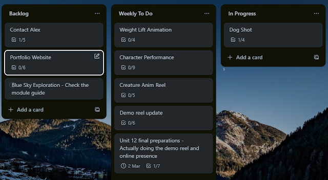
The images below show how I'm organising my workload across this section of the module. There is quite a lot going on so I wanted to break things into small chunks so that progress felt more positive as well as organised.
This shows my holistic tasks across this final unit to prepare my application materials :
I want to get a range of advice from Alex Williams so I've planned to reach out to him throughout this module :
This card tracks the major tasks in order to complete this module and then I plan to create smaller task cards to tackle these broad tasks :
C.V. Development
I've spent some time updating my C.V. Mainly some minor reformatting but also adding recent education experience : Advance HE Fellowship status and my Masters degree with grade pending. My C.V. is made in Illustrator which is annoying to format but it does make it look nicer! My C.V. is a little tricky because I have a varied work history and experience across the games industry and games, animation and VFX teaching. This does make me a varied candidate, however, if I apply for industry roles then all my recent experience is in teaching opposed to industry. I do however, have my recent experience with Squishy Sports and MADE BY TITANS as an indie start up.
Here are the recent developments :
I've also sent this to Alex Williams for feedback (17/02/25) and he suggested adding my core skills to the top. So I have modified the C.V. slightly to include ANIMATOR at the top clearly. I potentially may move the bottom section high up too, however, I feel the released titles are more important. I also plan to replace the portfolio link with my website and demo reel once these are created. I noticed that I didn't put the location next to Advance HE and University of Hertfordshire which is a slight inconsistency. I will update these things when I update this again after creating my demo reel and website.
3D Character Performance Demo Reel Development
25/02/25
This section explores the development of my demo reel. I intend to create 2 demo reels, one for character performance with some creature animation and then a separate reel that includes just creature animation. The below 2 images show my planning to start putting this reel together :
To tackle the main demo reel I'm going to work on implementing feedback on individual animations to begin with. I've started with the 'Dog Performance' shot to improve this animation. The main things I wanted to improve were the compression on the legs. The rig is a little fiddly and doesn't easily allow for movement on the legs to allow compression, however, I should be able to force it through some slightly awkward posing across a few frames.
This is my planning for the 'Dog Performance' :
This playblast below shows the tweaks and improvements to the animation, focussing on the legs :
This shows the final rendered version which will be integrated into my demo reel :
Next I'm going to move onto the 'Character Locomotion and Weight Lift' animation. Here are the actions associated with this :
This video below shows the improvements and final render. This includes a slight vibrate as the characters begins to lift :
26/02/25 - 27/02/25
Next was to make the tweaks to the character performance animation. This was the animation I received the most feedback on so wanted to improve it before preparing it for my demo reel. This Trello card shows the core improvements I was planning to make :
This video shows the improved rendered animation :
Next I wanted to make a title card that will be used at the front of all animations. I plan to use a similar style when developing the website to keep the branding the same. Whilst I haven't made the website yet, I didn't want to re-export everything again when I amend the title card. The domain is available and no one other than myself is likely to want this domain so I feel it is safe to move ahead with this.
This shows the final demo reel for 3D character performance :
I had an existing Animal and Creature Animation Demo reel, however, it was a little long and geared towards submitting a module assignment rather than a professional reel. Therefore, I wanted to tweak this to make it stand alone as a animation demo reel focussed on creature animation.
This was the existing reel :
This shows the to do list for this reel to highlight the areas I will be working on :
I started off by reviewing my Premiere Project file and simply editing some shots to shorten them, reducing the number of loops, replacing the dog video, adding the crow scene animation and generally tidying it up.
Next I drew my attention to the horse rearing animation by tidying up the 3D environment, setting up depth of field, editing the materials and lighting to create a better quality render. This video shows the improvements to the 'Horse Rearing' animation final render :
This video shows the final Animal and Creature Animation Demo Reel including sound :
Lecturer Advice
25/02/25 - 27/02/25
Whilst the previous videos were rendering I reached out to Alex for some advice on my demo reel. I was curious as to whether I should include any of my professional work from working at Eutechnyx to my reel. This was because the work I was completing now was significantly stronger in terms of visual quality. However, he said that the reel was good and its worth showing the breadth of experience in a separate reel. I followed up with asking about my 2D animation work as well, assuming the same answer which he confirmed. Therefore, I can create separate demo reels to show :
3D Character Performance - geared towards T.V. and Film animation
3D Animal and Creature Animation
3D Game Animation
2D Game Animation
Then when I create the website I can organise all the work there. This will show a range of skills and I can use whichever reel is most relevant to the job I'm applying too.
I also asked about the current working situation across studios, whether it was remote / hybrid / in office. Alex had said that it changes constantly but remote working is very much embedded. He shared this link with me to support starting a job search : Animation Blog: How to Find The UK's Animation Studios In this blog post this Animation Directory link was embedded : Directory | Animation UK. The advice was to then make a list and start from there!
Website Development
07/03/25
I have an array of different platforms and showreels therefore building a website would help bring all of that together and act as a launch pad to reach all of those platforms. I decided to use Wix to create a website to build and unify my online presence. Wix offered a free domain for a year and also had a nice freeform design tools that would help me build a simple but effective website to host my work. My plan was to use elements from my CV and video title card on my website to unify my branding.
Below shows my Trello card that shows my planned pipeline for production.
I looked mainly at Wix and Squarespace as the potential options. SquareSpace was slightly cheaper, however, Wix appeared to have more freeform design freedom which I felt would allow me to design more freely by placing assets exactly where I wanted. I was using an art centric approach I wanted this freedom and didn't want to have to 'fight' the tools. The difference in price was negligible and Wix gave you a free domain for the year therefore I decided to move forward with Wix.
This first section shows various art assets I've created to import to the website. My art skills are my strength whereas my web design skills are not! Therefore, I am planning to lean on my art skills to design and produce a professional looking website! I'm using the vector art tool, Affinity Designer for this which I own a software licence for. The image below shows my title taken from my title card I use at the front of my videos. I've separated the elements and exported them separately so that when I bring them into the Wix site editor I can animate them in separately.
I produced the following icons below to be used with email, phone and documents (C.V.). Wix did have some nice icons built in but I wanted to keep my branding unified so I created these. These will be in the footer that will be placed at the bottom of each page. This means that anyone who visits my sit will easily be able to access my contact information to get in touch with me.
This next asset is a background asset to be tiled in the background. Again I've used the same style as the rest of the website to keep the branding unified. I'm hoping I will be able to apply some interesting scroll effects to make this look more interesting, such as parallax. I also might need to adjust the opacity of this slight, however, hopefully I will have control over this in the Wix tools.
Now that I've got my core art assets I wanted to start blocking out the website in the tool. Initially I had thought that I'd sketch a design out, however, because I was going for a minimalist design I felt like I could design on the go. The tools were pretty simple to use and there was an array of different elements and containers you could use to place items in. Below shows the home page that includes the title, header, footer and my demo reels. The main thing I want people to see on my website is my animation demo reels so I wanted to have these front and centre. I then plan to include my wider portfolio on a separate portfolio page.
You can also see the socials bar on this image that links to my other platforms. I've set up the footer to remain always on the page. Therefore, this means that when someone visits my page they can connect with me on any of the various platforms they prefer, email me, phone/WhatsApp me or download my C.V. This should make it really easy for anyone to reach me!
This next image just shows the other animation reels you see when scrolling down the home page.
This next gif shows the short animation I made using the Wix animation tools. These are pretty nice - you can choose from a range of animations and add delays, which is what I used to get this overlapping animation effect! I thought this would work well as a nice home page animation that visitors see when they first access the website.
This next gif shows an array of things. Firstly you can see that the elements slowly reveal themselves as you scroll by fading in and out. You can also see the lovely parallax effect on the background as you scroll through the page. This looks so much more visually pleasing rather than moving at the same pace as the core elements. It moves but much slower to create that parallax and I'm really happy with this result.
08/03/25
Next I wanted to develop the 'About Me' page and I started by reflecting on the photo I was using. The photo below is the photo that I'm using across all social media channels, including my LinkedIn. I decide to use a fairly casual photo to make myself seem 'human'. The t shirt I'm wearing is from my favourite music festival which is a fairly low key nod to the things I like beyond work and potentially may be a talking point in the future. Whilst this photo is good I thought I could run a few edits to make it better. I wanted to blur the background and then run some minor colour correction to make it appear slightly nicer!
This image below shows the background blur and colour corrections! I think its looking a lot better, the blur in particular draws more attention to me and softens the noise in the background. The colour adjustments take out a little bit of the red from my face that was a bit over-saturated in the original.
I also wanted to create a black and white variant as this can sometimes look a little more 'professional'! I thought it would be really cool if I could make the image blend to colour on mouse over.
This shows the 'About Me' page with the photo and my description included. The description I've included is the same one that I've used across all platforms to keep everything unified. I also added a 'Download my C.V.' button here because it felt like this was the page where people would want to learn about me and my experience so I wanted to make this super easy.
22/04/25
Despite spending a decent bit of time on this photo I recently took another photo linked to one of my hobbies - hiking - that I felt was a better fit. I've then replaced all my professional images with this new hiking photo (LinkedIn, website, social media profiles etc.) ! Here are the updates:
New photo.
Example of use on website.
After this I started to build my portfolio page. This would include my animation reels from the the home page but also other work I've produced. This included my 2D art and animation across Squishy Sports and my art/illustration work. This means I could add new projects or categories in the future as they were developed. I used a carousel style asset that would let users scroll through my work from each category without each category needing loads of space. The image below is an example of using this carousel style gallery asset to upload my wider work on Squishy Sports.
The next two images show how the full portfolio page looks (I've renamed it from projects to portfolio!). You can see that its organised into sections with different gallery carousels. This is again a simple but effective approach to presenting my work, mirroring the same style as the rest of the website. In addition to this you can see how I've expanded the menu bar at the top to include easy navigation across all my elements. I added a blog button that links to my Blogger blog which houses all of my blog posts - like this one!
09/03/25
Everything was looking great on desktop, however, on mobile it looked terrible and needed re-adjustment. The image below shows the homepage which isn't displaying correctly. The mobile version uses all the same assets but scales differently so the main work that needs to be done is to re-scale and position all of the elements.
The images below show the tweaked versions, screenshotted from my phone. The title was very tricky to get it exactly the same as the desktop version because each letter is separate, however, since the style is slightly wonky anyways so it wouldn't matter too much. On the desktop version I exported a still of the full title card and then overlayed the individual elements. I didn't want to do this again because if I added another asset it would have added it to desktop and potentially altered that!
The challenge with the about me page was where to position the photo that would have been to the left of the text. Initially it put it after the text, however, I think it looks better with it before.
The portfolio page just needed some minor adjustments to the scale of the images so that they showed the gallery carousel but weren't too small. Simply increasing the size slightly to show a peak of the second carousel image or video seemed to be a good middle ground. I needed to adjust the scale of each section here to balance the elements better - mainly to include some blank space between the elements.
Overall this was a really good experience and I'm proud of what I've managed to achieve here. My online presence was decent prior to the creation of this, however, it was fragmented across multiple sites. This unifies everything and helps my personal brand identity stand out a lot more. This should make me a lot more recognisable and rememberable when engaging with people online and applying for work. I'm happy with the animations and movement effects across the full site - they are small but subtle touches that allow the site to feel professional. The minimalist approach works really well to frame and present my portfolio and allow the work to speak for itself. Next I need to integrate this website link into all of my socials and my C.V. and use it as the main tool to promote myself moving forwards!
Further C.V. Development
11/03/25
Below shows my updated C.V. including the link to my website in the portfolio section! I've also updated this across all my socials and prioritised this link as the main link to my work! Another minor tweak I made was changing the font to Helvetica. The reasoning for this was because I used Helvetica across my website and this helps unify my brand consistency too. I updated this document on my website and my LinkedIn where they are available for download.
Further Website Development: Feedback and Improvements
14/04/25
Whilst I was working on my academic assignment for this module I sent me website to a range of professionals for feedback with the view that I'd return to this and make improvements.
Firstly, I sent my website to my core subject tutor Alex Williams for feedback. This is usually my first step to support my understanding of what is going well and what could be improved. Furthermore, throughout this blog I have been learning from his resources and it felt like a test of whether I'd applied the learnings to a practical outcome well. This was the response I received (Williams, 2025) :
Whilst there isn't much in the way of developmental feedback I feel that this is high praise coming from someone as experienced as Alex! This showed that I was hitting expected standards of professionalism in the presentation of my work and myself which was great! However, I wanted to engage with some other trusted professionals to gain a wider perspective.
There is a local company, Atomhawk, who an ex-colleague, Tom Leighton, from Eutechnyx currently works at and I wanted to see whether they produced much animation work at all. I also had a connection recommendation for Callum Boyd, who is an animator working for Atomhawk. I reached out to both and Boyd (2025) responded first saying that they did and sent me their showreel showcasing some 3d animation and 2D animation work. I followed up with asking for feedback on my website and these were Boyd's (2025) thoughts :
Very distinct
Showreels show a range of strengths, but better to have 1 on the home page
Each piece could elaborate on roles and responsibilities
Case studies can work well
Ended on concluding that remote working is more readily available since Covid
This shows that my branding is working well, however, I could add some more information on my website to add more context to what the work shows. This would then promote my skills better and show my work in more detail. I also could move the range of showreels I have on my homepage to my Portfolio page and leave my main reel there. This logic would mean that if someone is interested ion my work they can head to the portfolio page to see more.
Leighton (2025) also responded to my query around the type of work Atomhawk produces. He explored that they have a small animation team that produces a range of 2.5D MOGFX with an increase in 3D animation work coming in (mainly in Unreal Engine 5). This is super interesting and highlights that one of the key areas I can develop my skills is with UE5 animation work. This is likely to steer my work for my graduate portfolio. I have observed growing demand for UE3D animation, area where currently expertise. Given the progress I have made 3D animation using Maya it makes sense to explore how I can and apply these skills to game engines.
Lastly I asked Stephanie Durrah, an indie publishing consultant and lecturer, who I have worked with in the past for feedback on my website's presentation. This was the notes from her response (Durrah, 2025) :
Streamline the social media channels as there are a lot to manage!
The font for C.V. in the footer looks like C.U. which could confuse people with dyslexia in particular.
Portfolio Scroll buttons are a little tiny
Solid C.V. but a little text heavy and some of this information could be saved for a cover letter.
Good scaling on mobile
I actioned the social media links right away and removed Twitter and Instagram. I mainly use Instagram for social rather than professional work so it didn't really need to be there. Also my plan was to move from Twitter to BlueSky due to the downward trend of Twitter in popularity since it's rebranding to X. My plan now that I have everything set up and realigned to my updated brand was to start posting work that I'm doing alongside professional updates. This was the result :
Furthermore, I removed my phone number from the footer to make it slightly less accessible. It is still in my C.V. and showreel, however, I would prefer to be contacted via email regardless.
Next I created a Trello Card to collate the improvements that I wanted to make based on Durrah (2025) and Boyd's (2025) feedback. Since there were some overlap in feedback - mainly how my portfolio was presented across multiple pages, it showed me that there was room for improvement to better present my work.
Next I tweaked my homepage to remove the variety of showreels and instead leave 1 core showreel. This was feedback from Boyd (2025) is intended to simplify the website and focus viewers attention on my main showreel. If a site visitor is interested in learning more they can click on my portfolio page and the 'about me' page.
Following on from this I needed to tweak my portfolio page to include all the work that I wanted to share. Boyd (2025) also suggested adding some notes to add more detail and context to the showreels. I added this on the right hand side in an easy digestible format. At the top of the page I added a quick menu to hop to different sections of the webpage. I've also added a 'to the top' arrow in the bottom right hand corner of every page. This should ease navigation, particularly for longer pages to hop to the bottom and then use the menu navigations to get to the desired section.
The image below shows further down on the portfolio page. You can see on the '2D Animation - Squishy Sports' I included a link that takes you to a page dedicated to detailing my work for Squishy Sports in more depth. This means I can somewhat streamline my portfolio page and allow users to learn more about this particular project if they wish. I changed my art and illustration carousel to an accordion style, which I felt looked better because it showed more snippets of the artwork I've produced. I also increased the size of the scrolling arrows next to this gallery to make them easier to see and press, this was feedback from Durrah (2025). I've kept the style consistent with the rest of my site to keep the branding locked together.
Next I noticed you could edit how images appear when you expand them on the website. I removed the white background, added a background blur and made the background greyscale. I felt this looked more professional and focussed on the particular element you were looking at. One element I'm considering adding is a short description explaining why I do art and illustration, however, I wasn't sure if this was needed. It is fairly self explanatory what is happening and I'm trying to keep the webpage looking clean and uncluttered.
These next few images show the Squishy Sports page which is only accessible through the portfolio page. The intention with this is that it is an expanded look into this project. I have significantly more work for this project than any other project because it spans many years of work and I was the only artist and animator on this project so everything visual in the game is created by me! I have a lot more work for this project, however, I have focussed this page on showcasing the gameplay trailer, character art/animation and environment art. Next to the portfolio visuals is a small breakdown explaining what the visuals are.
This is a look at the character carousel galleries. The text next to these gives a little flavour of who the character is and what media is in the gallery.
Lastly this shows the environment carousel at the bottom!
Now that these pages were created and tweaked I needed to set up the scaling and arrangement for mobile view. A slightly laborious task, however, relatively painless. The images below show the scaling work I have done for mobile. Firstly this is a section of the portfolio page :
This is the Squishy Sports page. I had to create buttons instead of menus because the menu wasn't working in mobile format. This is due to the simplified burger menu at the top. I did add Squishy Sports to the burger site menu to make it more accessible.
On the character gallery carousels I changed the layout to be stacked as the image shows. The thumbnail carousels just didn't look good on mobile and this made the media much easier to view as you scroll through. As such it does make the media sections longer so I decided to put the short descriptions on top of the images rather than below.
I've also added a short gallery to the about me page featuring a load of companies I've collaborated with, projects and game titles I've worked on. This is all on my C.V., however, a wall of logos makes it look impressive and shows my industry experience a little more prominently without having to load the C.V. document up and read it. This is what it looks like :
Overall, the website now feels a lot more polished and accessible thanks to these improvements! I feel it shows a good range of skills in my expanded portfolio, however, my homepage focussed on my core skills of 3D character animation. Viewers can now look more in depth into my work through the portfolio page and then even further on the Squishy Sports page. I'm pretty proud of this and I feel it looks great when I look through it. I feel it presents my work professionally, shows high quality outcomes and demonstrates my skills. It's also scalable as I can add to the portfolio page or create new similar pages to provide a deeper look into other projects. This flexibility wouldn't be possible on other sites and my branding absolutely wouldn't have been as strong!
Next Steps
This section explores my short and long term goals, looking towards the future and developing my career further.
Short Term Goals (Next 6 Months)
In the short term, I'm focussed on completing the Masters qualification. I have the assignments in this module to complete which I am making good progress towards and then I have the final module, which is a double module - The Graduate Portfolio. Given that I am juggling working and this Masters qualification I don't want to stretch myself too much, however, I do want to update my portfolio as I go. I will continue to engage with Alex and my peers on Discord to reflect on the quality of my outcomes and push the quality of my work to professional standards as I have been. I will also begin to look for my next steps once the course is done. My options include a new role at my current job, looking into University lecturing, considering remote/hybrid professional jobs or a blend of the above.
I do want to start building my online presence a little more through posting on various platforms and promoting my website and work. In particular, BlueSky because this was a new platform. If I craft some good posts and post them during active times I can mirror the content across multiple platforms. For example, since BlueSky and X are similar then I could post similar content. By doing this and engaging with professionals online I can organically build my online presence.
Long Term Goals (Next 12 Months)
In this period I would like to start a new role. I've achieved so much in my current role and career so far I would like a new challenge because I feel I am hitting a little bit of a ceiling. Therefore, following the plans in the short term goal I would like to achieve a new job in this period. I will use the process of 'rejection is information' to develop the quality of my outcomes. I will start to look at collaborating with others to produce animated short films/games. I will have a personal project on that is constantly looking to develop my skills - I will focus on lip sync and character performance. This will hopefully be a period of new beginnings and progress towards new roles.
Conclusion
This has been a fairly intense look at my professional materials that I would use when looking for work. I've pushed myself to make sure that everything is the highest level of quality possible and ensure that my branding is consistent across multiple platforms. I've realised that I am in a very good position to apply for work and the quality of my outcomes is good. I've learnt that my work is very much tailored towards working as an animator. I've also reflected on the fact that job postings are a wish list rather than an exact requirement and that I should apply for more jobs rather than a select few. I've explored the concept of 'rejection is information' in a positive light to understand that if you don't get a job then there is something you can do to improve your process next time.
My key strengths are that the quality of my work is good, as reflected in my outcomes and my grades. This means that I am in a good position to apply for jobs or to develop and polish my outcomes further. My branding and online presence is good through a range on materials including demo reels, social media platforms, LinkedIn and my website. Another key strength is that I have experience as an educator, which is something not a lot of people will have. This means that I can teach up to undergraduate level (Level 6) and I have good communication, leadership, organisation and planning skills. It also shows how resilient I am, which is not to be underestimated.
The biggest take away from this module for me is definitely to apply more broadly than I have before and not worry about ticking every single criteria. However, also to take the feedback from rejections to develop myself, my skills and my reel/application materials further. These materials should be look at as constantly in flux and evolving rather than being complete. I'm proud of all the professional materials I have developed, I've always been good at this, however, I feel I've really taken it to the next level in terms of professionalism and visual quality.
Learning Outcomes
Finalise your CV, demo reel, and other application materials to present your best self to potential employers.
Reflect on the knowledge and skills you’ve gained throughout the module.
Create a clear, actionable plan for your next steps in the animation industry.
Learning Outcomes
Boyd, C. (2025) LinkedIn Direct Message, 10 March.
Durrah, S. (2025) LinkedIn Direct Message, 12 March.
Leighton, T. (2025) LinkedIn Direct Message, 12 March.
Williams, A. (2025) LinkedIn Direct Message, 11 March.