
3d Art - Stylised Medieval Environment Set [Introduction to Animation Skills: Unit02]
3d Art - Stylised Medieval Environment Set
05/02/24 - 11/02/24

I wanted to use this unit as a way to really put my 3D art skills to the test - particularly as I haven't produced a 'finished' and professional 3D asset in some time. I'd read through the unit guide and videos and it seemed to be extremely basic. At this point I didn't quite understand how the course was meant to run - some modules had appeared and disappeared so my plan was to work through the first module but rather than completing basic work that I knew I could do I wanted to challenge myself and improve my skills. This was essentially a 3D art unit therefore I wanted to use it as an opportunity to make an awesome 3Dscene!
I had a few key goals that I wanted to get out of this :
- Explore sculpting and baking high poly assets to low poly game ready meshes
- Explore retopology to create game ready assets
- Boost skills in Substance painter to use more advanced features and have greater control over producing textures - particularly stylised textures.
- Achieve a Stylised 3D art piece
- Produce a small scene
In hindsight I've spent way too long on this mini project, however, I was really struggling to understand what I should be working on and what I shouldn't. Part way through this project I got clarity and realised I was about 3 weeks behind. I wanted to see this project out and then plan a catch up plan after this to get back on track with the weekly tasks.
03/02/24 - Research and Planning
I started off creating a rough plan in Trello - I have a holistic Kanban board set up, however, at the moment I'm using cards as the overarching unit outcome/goal and checklists to include a breakdown of the tasks. This works but I think I'd like to move to a more fluid Kanban approach in the future by using cards that move across my 'Weekly Backlog' > 'In progress' > 'Completed' columns to get a greater sense of progress. None the less - this is going to give me a percentage completion which will help me track progress. As mentioned earlier I am definitely behind at the moment and need to catch up - particularly as this unit isn't assessed.
I recognised that this does need to be a quick turn around so I decided not to use any drawing at this point to cut down time. I planned to gather references into a mood board as the core element of pre-production. In doing this I could then create my tasks for the individual assets that I would produce. The best way to approach this would be through the duplicate of assets to get a nice scene to get maximum 'bang for my buck'.

To kick off my mood board I explored artwork on Artstation - I wanted to hopefully find an artists concept art that I could credit and turn into a 3D piece. I found this wonderful artist called 'Yana Tosheva' producing some great stylised props : ArtStation - Stylized Props Design .

This gave me the idea that I could perhaps create a scene that presented these props - perhaps on a medieval table - in a tavern / study kind of scene. Ultimately the project didn't end up going in this direction due to time constraints. I actually started with the floor, used the techniques from this to build the table, realised I was running behind schedule for the full course and finished the scene with some simple props. This was the right call as I could get a high quality outcome yet move forward with the project and not get hung up on this aspect. Despite not using this concept it did steer the direction of my 3D scene therefore was useful in establishing the art style.
I'm using PureRef as a package to gather reference. I love the way this package works and can easily overlay software packages. I have 1 large 32" monitor, therefore being able to overlay my references in lieu of a second monitor is very powerful. The free-form space works particularly well for the way my brain works, I tend to go off on tangents or arrange images in a 'spider leg' fashion so that it grows from the centre and each leg is a collection of a similar type of images. For example in the image below you can see me gathering scenes at the top; wood reference at the bottom and chairs around the middle.
I was searching for images that I could refer to for sculpting wood - looking for the grains and colours used. The grains would inform the patterns I planned to sculpt and the colours I planned to replicate in Substance Painter. You can also see a collection of assets and styles I wanted. I was really inspired by chunky wood and cartoon-esque art styles a kin to games like 'Sea of Thieves' and 'World Of Warcraft'. I was happy the the references I gathered here achieved my goals and would support my development across this micro project. I can sometimes over research and include way too many images that the research becomes pointless so I tried to only gather a handful of each to focus my inspiration. I also knew that I could add to this as needed if I needed particular reference for a specific element.

This chair image really encompasses the goals I wanted to achieve from sculpting and texturing to achieve that chunky, cartoon-esque wood style that I described.

This image show the full board board that I put together as described above.

The above images are shots from the game ‘Sea of Thieves’ showing the style I was aiming for.
Technical Research
I feel I learn incredibly well independently and can source the technical tutorials I need and then adapt to my own needs based on artistic judgement. One of my first goals was to improve my sculpting ability so I looked at a couple of tutorials via YouTube to gain an understanding of the tools and processes people were using. I planned to apply this to a simple floor board that I could then duplicate and rotate to create a floor that didn't look duplicated. I was looking out for the tools that were being used and how they were being used. It would also have been beneficial for me to find tutorials in Blender as this was the software package I planned to use - I'd used it before, it's free and the sculpting tools are commonly compared to Z Brush as being good but not quite as good!
This video I really picked out the 'Scrape Brush' that was being used on edges. I'd always wondered how people got these damaged yet cartoony looking edges to metal and wood elements - this seemed to get pretty darn close. The 'Draw Sharp Brush' was used a little too to crave into the mesh with some layering using the 'Clay Strips Brush' so the surface wasn't even. The 'Crease' tool was used a little to work into the grooves and finally some use of 'Pinch' on the edges to make them crisp or taper the grain elements to more of a point.
Another key point was the use of 'Remeshing' to create dense, high poly topology that allows you to sculpt. I'd never succeed much with this technique in the past but to be honest I didn't really understand it. It always seemed to destroy the detail I'd sculpting in so I shied away from it and I'd always used 'Dynotopo' to add relative and live geometry on the fly. However, when I experimented with Dynotopo it really wasn't responding like clay and I started the see the limitations. Upon experimenting with remeshing I quickly saw the advantages, in particular not being scared to set the topology really high. I was worried this would crash the computer and whilst it did in some cases I found a happy medium around the 0.005 voxel size. Other advantages were that my meshes really felt like clay and I was able to manipulate them as the tools intended.
I did a little more research into this tool and became even more confident through the use of 'R' to preview the voxel size and then 'CTRL + R' to Remesh. I become fast at manipulating my mesh. I also looking into the Quadraflow tool which in some instances gave me slightly cleaner topology. A standard voxel mesh gave me some odd 'banding' across the topology - however, at the high levels of verts I was using this didn't cause an issue. I liked the look of some of the more advanced techniques such as remeshing with Quadraflow and then shrink wrapping to a higher mesh to ensure that the mesh kept the form but had less polys and strong flow, however, this seemed a little excessive at this point and I was planning on using Maya's auto-retopologise tool to speed up my workflow so didn't need this level of depth at this point - I just needed to be able to sculpt, Remesh and repeat without loosing the detail I'd sculpting. However, I've saved this video as I'd love to refer back to it in the future!
Back to sculpting wood! I wanted a broad array of perspectives on this so also found the below video to be useful. What I didn't like about the first one was that the masking and inflating just wasn't giving me nice results. I also wanted to really carved into the mesh a bit more 'manually' and get that organise feeling to the wood. This artist was using the 'Crease' tool to carve into the mesh to get the wood grain. They were also using the 'Clay Strips Brush' to carve knots and dents into the wood which seemed to work better than the masking method to me. Another great thing they did was using the 'Grab' tool to move the edges around a little so that it wasn't perfectly straight and again felt more organic - however, this did need to be used sparingly or you're have some proper wonky wood!
Modelling and Sculpting the Plank
I started off right in Blender with a cube that I scaled into a long thin plank shape. Applied transforms and hopped into sculpting right away. Starting with the Remesh knowledge - I actually used the Remesh modifier, set voxel size to 0.005 and applied this, checking the wire-frame to see that it had worked. It took maybe 20 seconds to process and then we were good to go so I grabbed that 'Scrape Brush' and went ham on the edges - I really enjoyed this! The stylised 'damaged' edges look was quite easy to achieve with this brush. I used a graphics tablet and turned pressure sensitivity on the strength to enable me to quite loosely and freely roughen up the edges. I paused in some places and worked into them 'harder' to apply a varied level of damage and this was working great throughout. I was loving changing the angle and allowing multiple 'scrapes' to interact with one another to create these lovely edge highlights where they met.


After I’d roughed up the edges the next goal was to get the chunky wood grain. I did try the mask and inflate method the first video showed me, however, I really didn’t like the results - it felt too square and it wasn’t easy to tweak.The second video used just the ‘Crease’ tool so I used this to carve into the mesh. This tool does tend to look a little soft - it seems to be intended for fleshy creases but the outcome seemed okay enough and I was able to draw through the model. I used that ‘Pinch’ tool to create any tapes and you can also see the knot that I carved in using the ‘Clay Strips Brush’ and smoothing it out. It felt a little flat initially so I used ‘Clay Strips’ again but this time to add and build it up around the edges. I used the ‘Grab’ tool to move the edges around so that it wasn’t so uniform - sparingly as I stated earlier Lastly I used ‘Pinch’ again to create crisper edges to get a more crisp highlight when the light hits it.

I’m not going to lie, I was pretty happy with this sculpt. I felt I’d effectively used the tools to create a stylised sculpt that resembled the art style I was going for. The creases were a little smooth so when I sculpt some other wood assets laters I wanted to explore other ways I could carve into the model - but for now I was happy enough with the outcome and wanted to move on. The next stage was to retopologise, UV unwrap and then bake the high poly sculpt to the low poly in Substance - following the game ready asset pipeline.
I exported the asset from Blender to Maya, making sure to convert the 3D space from Z-Up to Y-up using the FBX export settings. I used auto retoplogise which cut the asset down significantly - you can see the wireframe with the bake overlapped below. This worked fine - I perhaps could have been more aggressive with decimating the topology down, however, as this wasn’t going to go into a game engine and I was preparing my skills to work within rendering in Maya for Animation I didn’t feel I needed to push it to be any more low poly than it was. This essentially meant that I could keep the 3D form and the slight nuances in different form around the silhouette closer to the high poly but without the ridiculous number of verts the high poly needed. UV Unwrapping was really simple for this asset - I just ran a planar map to create the UVs on the full asset and then created seams on the corners and then around the bottom edge. This allowed it to unfold in a cross shape with the bottom faces attached to the side. Nothing too fancy but it worked perfectly - I’ve not focused too much on presenting these UVs as I’ve focused more on the baking and texturing.
The below series of images show the low poly mesh with the baked normal map. I used Substance Painter’s baker to create the cage around the mesh to encompass all the high poly detail and ran the bake. It worked first time and the results were beautiful. As you can see all the high poly detail came through with no artefacts. I rotate the light around the mesh and it reflected the forms from the sculpt with the light catching the edges of the detail to give a crisp highlight. You can see the low poly wireframe and how much detail from the sculpt is coming through - it looked awesome!


This essentially was my proof of concept and a test of my sculpting ability to transfer to a low poly mesh. I was really happy with the outcome as I had been worried that I over complicated the process and would have wasted time. However, the time I had spent was on a more simple asset. My next steps were to explore Substance Painter’s ability to texture assets from a stylised perspective. I’d taught an array of techniques in the past but again never really followed any of them through to a finished outcome. I wanted to achieve that stylised art style and apply it with care. My next steps were to explore some more technical research to find a video that could highlight techniques that would help me achieve my goals.
I searched though a few, however, the video I found below seemed the most effective. It used an array of key techniques that would work for my asset. They were :
- Base colour
- Base colour variation using a grunge bitmap mask
- Blur Slope filter on bitmap masks to create stylised edges to the variation
- Use of curvature map to isolate edges
- Invention of curvature map to isolate dents and cervices using a levels adjustment
- Blurring of curvature maps to create a fall off
- Use of UV projection to overlay gradients
- Use of AO masks to have control of the AO spread across the model
- Use of soft light to add warmth to areas.
As you can see below the techniques I learnt achieved in my opinion a high quality outcome. I’ve created a varied base colour that also drives a varied roughness channel, which prevents the base colour from being too uniform. I’m using the curvature map to isolate the edges and then I’ve lightening the colour and smoothness to allow the light to catch these further. It’s worth noting the curvature map is baked from my high poly so it’s the high poly edges I’m catching. I’m also using a similar technique to isolate the crevices through inverting the levels and tweaking the range to isolate those areas. I’m then setting those crevice layers to multiply to darken these areas and then setting the roughness to more rough so the light doesn’t reflect off these so much. I’ve implemented the AO bitmap mask using multiply and a dark colour and then turning the opacity down low so that is isn’t overpowering but I’m emphasising the AO ever so slightly. Finally I’ve darkened each end of the plank because I thought when I duplicate these in Maya it will add a bit more variation to the colour of the floor pattern.
As soon as I finished the texturing I’ve then rendered this in Substance’s IRAY render, which is really easy to use. I chose one of the studio lighting HDR maps to get a 3 point lighting set up and I have turned the background slightly green as a complementary colour to the red-ish brown of the asset itself.


I was really happy with this outcome. I loved how the sculpt pulled through the detail and how the baked mesh maps like curvature allowed me to control the texturing in a stylised manner. The asset felt finished and professional and again achieved my proof of concept of my pipeline of sculpt > retopologise > UV unwrap > bake > texture and render. Whilst IRAY’s renderer is lovely and easy to use - I couldn’t render a scene or an animation here so my next steps were to explore the Substance to Maya Arnold pipeline. I updated my project management to tick off the tasks as I was going - so far this had taken about 4 hours including my research and I felt I’d learnt a lot that I could apply to other aspects of the project’s vision - therefore, this was time well spent in my opinion.

I’d worked on the Substance to Maya Arnold pipeline before but had got confused and got poor results so I wanted to revisit some tutorials to check my processes were correct. I found this video that was clear and succinct. It showed me :
- Exporting using the Arnold ‘aiStandard’ template
- Creating aiStandard Materials
- Assigning textures in the material
- Setting the colour texture type to sRGB
- Setting all other texture types (Metalness, Roughness, Normal) to raw
- Setting the normal map in geometry as tangent space normals
Following the steps I outlined everything went in perfectly and appeared as I expected. I threw in a standard sky dome Arnold light to get some generic day lighting to render the asset. I knew I’d explore proper lighting later so adding this sky dome and fiddling with the intensity to get it exposed enough should be fine for now. You can see the first image is a little darker than the rest and if I increase the intensity I got a result more a kin to the quality of render and lighting from Arnold.


I was really happy with this again! I felt like I’d gain some key skills and produced a quality outcome. Following on from what I was discussing earlier I’ve now completely proved the full pipeline to now back into Maya for rendering. This means I could use these skills when building a set for an animated scene. I love the colour of the wood and the variation I’ve achieved. The colours I’ve picked are reflective of stylised outcomes which was my goal. I feel if this asset was seen in ‘Sea of Thieves’ it would not look out of place. The only thing I’m not as happy about was the grooves I created using the crease tool are a bit smooth. This is something I plan to experiment with when I produce the wooden table - to build on what I’ve already learnt. The render doesn’t look quite as nice as the one from IRAY but I hope to improve the render quality when I render the full scene, however, at this point I wanted to progress and had achieved a lot.
04/04/24 - Creating the Table
My next target for development was going to be the table. This would be a real hero asset in the scene and was likely to take the longest. I wanted the table to be made up of a few planks on top with some supporting structure bolted together by some metal parts. I’d already proved my development of wooden assets so including some smaller metal elements would allow me to stress my skills a little further.
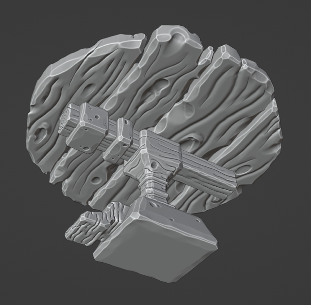
I started in Blender again with a cylinder that I then used Boolean intersections to split into multiple planks. I used some difference booleans to create some major cuts into the wood and I ran a bevel around the full mesh to soften the hard edges initially.

I was very aware that I was ‘free-styling’ the proportions so I wanted to ground this table into reality. I researched average chair heights which came out at half a meter on average so I created a little cube that was half a meter high and then increase the scale of my table to be the right size in relation to this reference piece. You can also see the rest of the assets that I produced. I added a beam into go across all the top planks to support these. I included a thick and thin metal bracket to make this support beam more interesting - particularly thinking about breaking up the colour in the texture at the end. I then have the main verticals ‘table leg’ that I included a gap for the support beam to sit in and a metal but that would bolt the support beam in place. This main table leg I included a small bit of detail to vary the silhouette and show a bit of detailing to the carpentry of this piece. The 3D trapezoidal form at the bottom would again be a metal section that the main table leg would sit into and the table feet would also slot into this. This is the curved shape at the bottom - I wanted this to have a more interesting flowing shape in contrast to some of the more block-y forms.

You will notice at this point there is just one table foot, screw and thick/thin brackets. This is because I plan to duplicate these elements to save UV space later and use mirroring, which will maximise my texted density long term. I did plan to do this when I got the asset back into Maya ready for rendering rather than doing the duplication now because I thought I might run into some issues with baking so wanted to keep it simple.
I was really happy with this as the base mesh and was ready to move on with the sculpting. Given what I had learned with the plank asset I wanted to explore different tools to create the grooves and I also wanted to be a little more aggressive and exaggerate the wood effect on this asset. I wanted to exaggerate this a little more than the plank because I wanted it to stand out from the planks as a hero asset. I started by remeshing and using ‘Grab’ to move the edges of planks around so they weren’t so straight. I swapped between the meshes quickly using ‘Alt + Q’ to switch between active objects. What I needed to be careful of here was making the planks still look like they slot together but not too perfectly. It needed to look hard crafted but also natural. Therefore I spent some time moving the edges around to get them tessellating but not too perfectly.
This time around I used the ‘Draw Sharp Brush’ to carve into the mesh. This worked really well but it did look a little sharp. I tried smoothing but this lost the detail I created, however, if I used ‘Draw Sharp’ and then ‘Crease’ this smoothed out my cervices without destroying the structure. So I used this technique! ‘Draw Sharp’ to create the crevice; ‘Crease’ to smooth it out and normalise it and finally ‘Pinch’ to create the taper. I also created stronger tapers by using the pressure sensitivity on the strength component of ‘Draw Sharp’ and using the physical whipping action of my stylus on my graphics tablet.


I decided to sculpt underneath too so that I could get a few renders from different angles at the end of this project. Another technique I was using was to keep the wood grain cervices flowing around the edges rather than just being on the top and the bottom. I felt this made it look more believable and really three dimensional. I was really happy again with this and felt the effect was higher quality than that of the plank, which was great as this was more of a hero asset for the scene. It felt really chunky and wood-like and again matched that ‘Sea of Thieves’ art style I was going for!
The following images show more of my development to create the wood effect through my sculpt. This was taking a little bit of time but it was really enjoyable - particularly as I felt I was getting high quality results. The bottom image in this little block has the ‘cavity’ view port render option turned on which really picks out the highlights I’ve sculpted - this made it look really solid and enabled me to image how I could pick these out in the texturing process using the curvature map.


05/02/24 - Sculpting the Rest of the Table!
I continued using similar processes to what I have already described to sculpt the rest of the high poly table asset. Starting with scraping the edges and then adding the grooves as previously described. I put quite a lot of detail into the end of the support beam to try and make it look like a cross section of a tree with some stylised rings as you would see in the middle of tree. Whilst sculpting I was referring to my reference images to create an array of thick and thin grooves of varying length and width to add variety.
In this phase I also explore the sculpting of metal. This needed to look solid and obviously didn’t need the wood grain. I scraped the edges to make it look ‘hammered’ into shape and instead of wood grain I carved in a few dents. These were looking good and would again allow me to vary the texture using the baked curvature mask. The project was going really well and I wasn’t encountering too many problems. It was fairly therapeutic and I felt really connected to my art skills as I sculpted with my graphics tablet.


Now that all elements were sculpted I took it back over to Maya as I did before and used retopology tools to create usable low poly meshes that I could transfer the high poly detail over to with a bake. I started running into a couple of issues. The first was that since my meshes were much higher poly than my plank - Maya was running quite slow at times and crashed a couple of times when trying to retopologise. I also struggled getting some meshes to retopologise automatically that mirrored the silhouette of the high poly - particularly around the sharper edges. To solve this I looked into manual retopology using quad draw. I knew this tool but again wanted to learn more about the tools and processes that were available.
I took the approach of retopologising each piece one by one and saving after each time in case of crashes! This proved effective and speed up my pipeline significantly.
Below is an example of one object in the table that I manually retopologised. This was pretty fiddly but I got into a good groove of starting really low poly and then holding ‘curl’ to insert loops that would then mould to the high poly sculpt as I was using the high poly as a live mesh. I also used the smooth topology function in quad draw to spread the polys around the model. One by one I got through the full table asset. Again I probably could have gone lower poly but I wanted to balance between quality of form and silhouette with the amount of polys. All objects were significantly cut down and would still be usable in a game engine - even if I could have optimised a bit further if I invested a bit more time, however, moving on with the project was more important!
The below image was my first attempt at quad draw and I didn’t actually end up using this one. I wasn’t happy with the way the polys landed on the end - you can actually see a triangle in there too. I felt it wasn’t forming around the corners well and the mesh was getting a bit unruly to manage. So I scrapped this one and started again but kept it lower poly initially which made it more manageable. You can see the effect of this in the full table image just below - I was more happy with this outcome as the topology flowed more around the mesh due to starting low poly but making the polys follow the shape of the model and building up the detail over time.

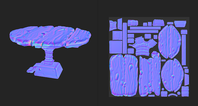
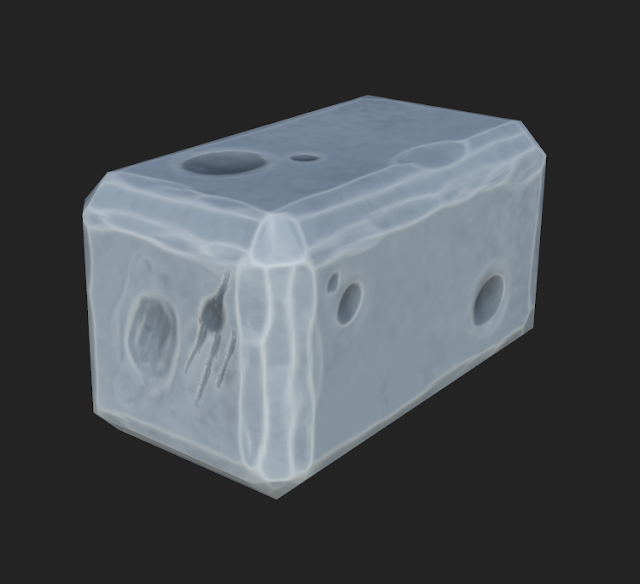
Below shows the wire frame and poly count of the full table. As you can see I’ve created a pretty clean mesh and relatively low poly at 5.5k polys. I used some special topology techniques in the rounded elements of the mesh - they were a 3 pole join. This is were 3 quads connect around a single vertex rather than the traditional 4. This enabled me to keep the flow as I described earlier. For the more block-y forms I actually just used a cube with a single face bevel around the edge to hug the form. I was a little worried about this as it didn’t originate from the high poly, however, it did work perfectly! (I’ll discuss the bake later!) It also meant I kept these elements of the table really low poly which was good due to the optimised nature of the asset that I was going for with this asset.


I was happy with the low poly count and the forms I management to maintain. Some parts were trickier than others but I did have to trust my settings and let my PC tackle the retopo or adopt the manual approach and in doing so I got the low poly. I also set the mesh display to be soft so that I could over ride the normals in the bake - sometimes if edges are left harsh you can get ‘creases’ appear even after you’ve baked.
The below image shows the high poly and low poly meshes overlapped to show that they occupy the same 3D space. I renamed all the assets accurately and added the relevant suffix ‘_High’ or ‘_Low’ to the assets so that I could bake per object in Substance. This means that each asset won’t bake onto each other and prevents artefacts from appearing.

The below image shows the low poly mesh with soften edges on. As discussed these Maya based normals will be overwritten with the normal map in the baking process. At this point I also took a similar UV unwrapping approach by planar mapping to create the UVs and then cutting edges to create seams and allow the UV shells to unfold flat. I would check the checker-board pattern to ensure that the squares appeared square and not stretched. I also oriented all the shells to be straight so that when I laid out the UVs they would be neat and readable. You can see the UV’s on the normal map image below.

The below image shows the baking process in Substance Painters and particularly the cage. I did have to extend the mesh to make sure no detail was clipped off. The Substance baker highlighted any areas that wouldn’t bake in red so I just altered the cage frontal distance until the preview showed no red.

The below two images show the low poly mesh with the baked normal map display. I was happy to see that each mesh baked perfectly with no artefacts - I feel Substance has massively improved the quality of their baking process in the latest version that I was using here. The last version I’d used was Substance 2018 and I’ve had way more issues with that version!


The below image shows the normal map and also the UVs. This also shows how clean the bake is - I’ve had bakes happen in the past where there are lots of glitch-y artefacts, however, this looked smooth and sat nicely across the mesh. When rotating the light it picked out all that detail perfectly even though it was that low poly mesh! Very happy with the quality and professionalism in this bake!
I used the techniques I learnt from earlier to texture the wood and was equally happy with the outcome. I love how it picks out the curvature from the high poly and how I can use the curvature to pick out the edges and alter the colour of these. Same with the dark aspects - it gives it that stylised effect whilst also feeling like wood! At this point I’d thrown a basic metal base colour on but hadn’t done too much else!


06/02/24 - Completing the Texture with Metal!
I had already textured wood but not metal! I actually adopted a similar approach but using different colours and this time I experimented with the metalness maps. For the wood I’d actually turned metalness off completely because obviously wood isn’t metallic so it was redundant. I used similar curvature techniques to pick out the edges and crevices, however, made these very shiny this time to give a more polished effect. I varied the base colour by using grunge maps with a slope blur to get these lovely patchy, stylised sections of variation that were in fitting with my style. I brought in a few greens to vary the colour and I felt this made it more stylised but also more believable as a material. I was also able to use this base colour variation to vary the roughness and metalness which gave it a galvanised appearance when the light rotated around it.


The above 5 images were my renders from Substance that looked absolutely stunning - I used a similar 3 point lighting setup again but the colours made it feel really stylised and professional to the art style I was going for. The below two images were from Maya Arnold when I exported it back there and used the same sky dome to create the lighting for the render. It was a little dark underneath the table, however, this was due to getting a more realistic light representation in Maya Arnold renderer and again I didn’t need to spend too long exploring lighting at this stage I just wanted to make sure that my assets were set up and ready to go in the scene. The metal didn’t look quite as nice as it did in IRAY, however, I thought this might be due to the cast shadow from the table so ignored it at this point!

The metal did look a little better when I turned the render flooring polygons off. (I’d built a simple curved polygon flooring so that I could get some AO on the ground) However, it wasn’t as shiny as it was in Substance. This would be something for me to research further into at a later point!


This table had taken a little longer than expected and I really just wanted to finish this 3d scene. My next goal was to create some blocks to duplicate and make a wall and some props for the table to give it a bit more of a reason to exist. I was thinking of maybe some dining props or some candles perhaps!
07/02/24 - Creating the Table Props
Given that I wanted to round off this project and initially I was going to create some of the props from the artist I found on ArtStation - I thought this would take too long which is why I wanted to create something simpler that would still look good. I expanded my mood board with images of cutlery and candles/candle holders to give me some inspiration.

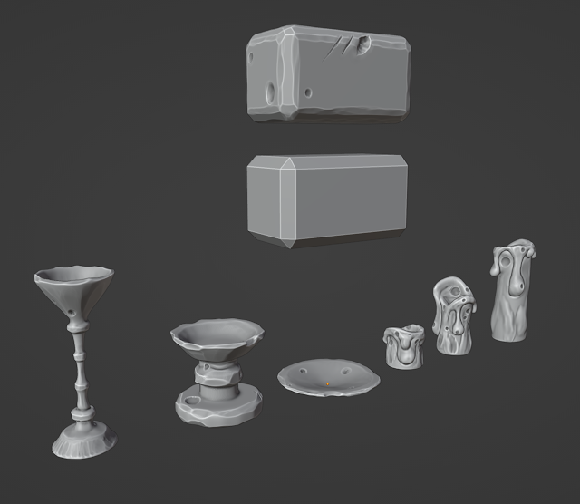
I started by trying to create some cutlery but it honestly felt quite boring and even though I tried playing around with the proportions I couldn’t get it looking interesting. I was also running into issues when trying to sculpt thin pieces of geometry. The mesh kept overlapping with itself and whilst I tried a few techniques by altering the brush settings, nothing looked as high quality as the assets I’d already created. In light of this I tried going for some candles which were chunkier and hopefully easier to sculpt! I thought if I could make 3 variations of heights for candles and the same for candle holders then this would give me a lot of options and should make for an interesting render!
Below you can see my candle sculpts. I’ve gone for that really chunky and exaggerated wax drips with some nice variety in the texture to the wax to keep in with the style of my scene. I was really happy with these, way more so than the failed cutlery attempts! I loved the chunky nature and slightly wonky aesthetic that I was building up in all the assets!


08/02/24 - Creating the Table Props… Continued!
I moved onto the candle holders and did actually run into some issues again. I was having a really hard time remeshing these circular objects - when I remeshed them they came out almost faceted for some reason and then when I tried to smooth the ridges I was losing shape or affecting other parts of the mesh. I was a little too focused on keeping them perfect. I probably sunk about an hour into trying to solve this and researching ways to remeshing better but I wasn’t really getting anywhere and was getting frustrated that I was losing time. I kind of had a bit of a ‘screw it’ moments and aggressively smoothed out the remeshed ridges and then used ‘Clay Strips’ to layer the detail such as the ridges on the stems back in that I’d lost from smoothing. I then used the ‘Scrape Brush’ to get some nice damaged edges coming in to polish off these assets. This gave me a less than perfect in terms of symmetry outcome, however, a more than perfect aesthetic for the art style. Given that I was going for wonky I needn’t have worried as much about getting a perfect finish and in actual fact the imperfections made it better.
I applied the same techniques to all the candle holders. I also created the wall concrete block and added some rock like damage to it. You can see that I’ve kept the low poly base mesh as from what I’ve learnt about baking I know that this is likely to bake down nicely and will keep my target low poly mesh really low poly. The other assets I would retopologise and UV unwrap in Maya.


I was super happy with these props - again I think they would look perfect in a game like ‘Sea of Thieves’ due to their stylised, wonky nature. The below image shows the retopologised assets and the UV map. As these are small assets that I planned to duplicate I thought it would make sense to keep them all on one texture sheet so that my 3D scene wasn’t instancing too many textures. I straighten all the UVs out mostly - there was one thing strip that I did want to make straight but was running into issues and didn’t want to sink time into learning how to do this. Even though it was curved the shell was properly unfolded so I was happy to move on. The down side is that it will be taking up a little more UV space than it needs to. It is worth noting that I didn’t include the brick in this but I planned to use a much smaller texture resolution for this asset to help with performance therefore I was achieving my optimisation in other ways.
The assets were around 1k tris each which is a little higher than they could be. I used the auto-retopologising and although I could have gotten a better result by manually retopologising with Quad Draw it would have taken a lot longer and I wanted to wrap this up!

10/02/24 - Baking and Texturing the Table Props
I followed the same baking process as I did on the table with multiple objects by naming the assets and using suffixes to allow Substance to recognise the different assets. The bake has came out beautifully again and transferred all of that lovely sculpted, high poly detail to them but using the lower poly meshes so they are more optimised.


This above and below image shows the wire frame of thee assets against the high poly detail.


I began the process of texturing. I used similar techniques to texturing the metal, however, this time I wanted it to appear more silver. I achieved this through a more icy blue and green base colour (layered variations using grunge bitmap masks) and a higher metalness value. I love the outcome! It felt like stylised silver and looked different enough to the main metal I used on the table. That blur slope I used aggressively as a filter to get the stylised transition between the blues and greens to give it almost a painterly look.

The candles I used all the texturing techniques I’ve described in this blog post but from a completely free form approach - there’s not many tutorials on texturing stylised wax so it was a real test of what I’ve learnt! One of the key things I did here was to overlay a UV projection to create a soft gradient from dark to light - I honestly think this really makes the whole asset. I was thinking that wax would be softer and therefore lighter at the top and more solidified at the bottom and therefore denser and darker. I also used the similar curvature techniques to pick our the edges and cervices that helps me really define the form of the shape through texture. I was super happy with the outcome - it looks like stylised candle wax and I was happy I was able to implement the knowledge I’d learnt but apply to a new asset.


The above images are a range of angles of the table props together as renders from IRAY.
Below are images of the wall block again I used similar techniques to described already. This asset was fine - I do wish I added a little more variation - perhaps a couple of different sculpts and colour variations so that when I duplicate it isn’t all the same, however, again in the interest of time and the fact this is just a brick I didn’t want to sink any more time into it.

I was now at the point where all the assets were made, textured, in Maya and test rendered via Arnold. It was finally time to get the scene constructed, lit and rendered to round off this project! The end was in sight - as you can see from my Trello task card!

11/02/24 - Constructing, Lighting and Rendering the Scene
So everything was in Maya, my file was 2GB and I’m not going to lie it was starting to chug a little! I’d set up my project folder and my textures were neatly organised into folders within the source images folder. I’ d also set up layers for the render assets (lights, camera etc.), low poly assets and high poly assets. To speed up the scene I deleted all the high poly assets - I had them as FBX exports so I didn’t really need them in the scene any more - they’d served their purpose through the baking and texturing processes. This did speed up the scene which made it easier to work with!
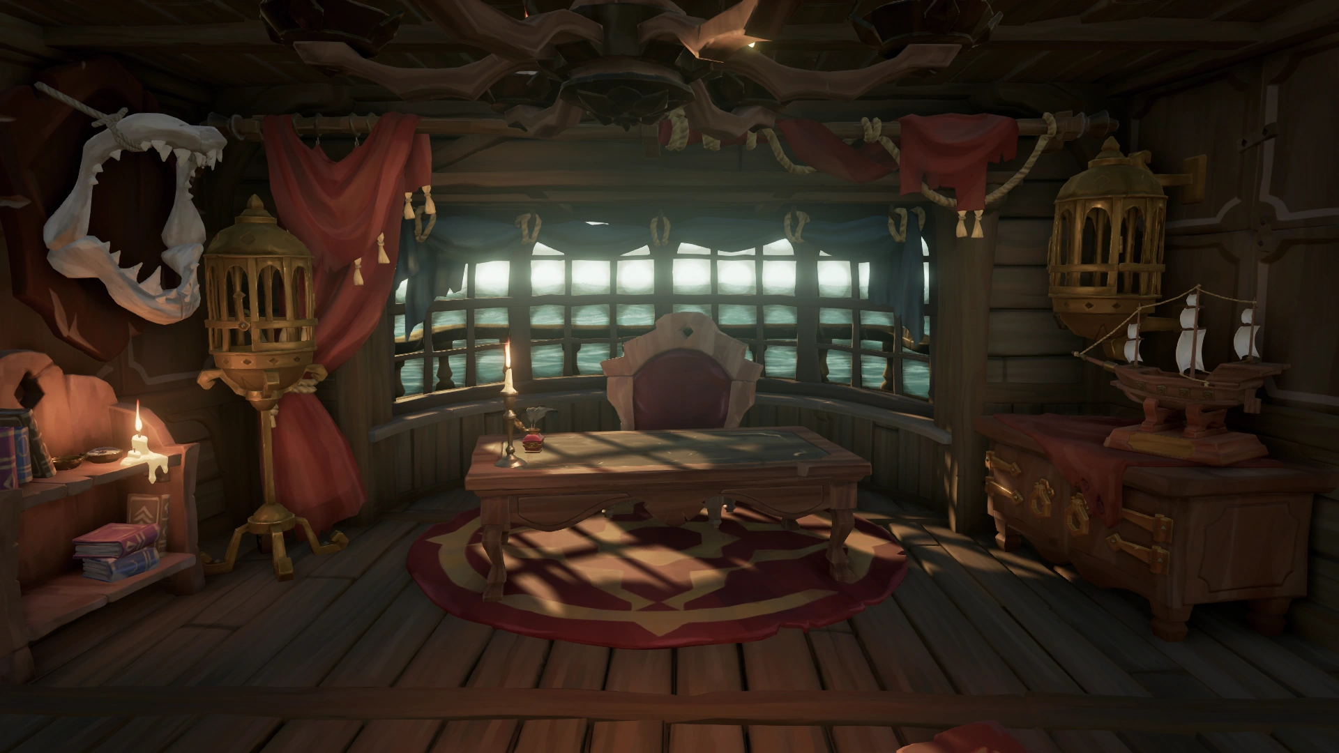
I wanted this to look like it was a corner or a section of a room with the table as the hero asset; wall as the background and a whole lot of candles at various heights - maybe this was some kind of cult or shrine…! I spent a bit of time and got the following arrangement. I made minor tweaks but it largely stayed similar to this. I’ve also included the wire frame to show the topology of the wider scene. I’m happy with the arrangement, I wanted it to feel a bit wonky again as I was never going to complete a full environment so I wanted it to look like someone had ripped this chunk off and I think I achieve that through the varied arrangement of the wall, floor and candles. I didn’t like the table top being in line with the floor so I later rotated the table to be a little more organic and break up the perfect symmetry.


I used the video below to learn how to create some candle lighting. I actually chose candles as it would give me a reason to light the environment as well as props for the table. I learnt :
- Making mesh lights - I modelled a flame shape that I turned into a mesh light.
- Ensuring the mesh actually displays in the render rather than just omitting the light.
- Applying a colour ramp to alter the colour of light. I’d done this previously but it was good to see how I could use the colour ramp to drive light colour.
- To apply a small bit of atmosphere to allow the light to permeate through the environment.
- Altering the mesh light settings to increase range of lighting.
The below image shows the colour ramp I used. I tried to use the colours I thought a flame would go through from white hot to elements of blue before predominately warm reds to yellows.

The below image shows my render settings. I was initially using my CPU which took forever to render anything but when I flipped to GPU it sped up my processes considerably. The adaptive sampling was good at processing the quality of images but actually ramp up render times loads so I knocked down the max samples from 40 to 10 which really sped up render times again whilst also giving me a quality outcome. you can also see the atmosphere volume I added with a low density to help the light permeate through the scene and make it feel more ‘real’.

Below is a render of my candle arrangement. I’m actually really happy with this! I love how the colour from the ramp node hits the dent in the top of the candle - you can see the blue coming through. I also love the variety in flame sizes I used so that it didn’t feel too copy and paste. The quality of the render is also very nice - a bit dark but it does feel atmospheric with the glow of the candle coming through. I could have perhaps experimented with this further but the renders were still taking about 20 - 30 minutes and I wanted to move on to rendering the full scene.


I actually began this write up at this point as my Trello tracking shows. I used the render time to enable me to start formatting and explaining my processes in this post and allow the render to take its time producing some quality renders!
The below images are a collection of screens shots to show the arrangement and the corresponding render.


The above render I created as a sort of default/no light render - again a little dark under the table and the metals aren’t pulling through as described earlier. However, I wanted to finish the project and move on. I’d learnt so much that this was something I could come back to and improve. The colours on the other hand are pulling through lovely - the wall is a little same as mentioned earlier but I think I’ve nailed that stylised look and feeling to this piece which was one of my original goals.


The above images are a zoomed in shot - I’m losing a bit of detail on the wood colour but the candle lights are feeling nice and real! I’m actually using a really love value on the sky dome to get a bit of bounced light like effect into the scene, however, I definitely could explore lighting further to capture this mood but see a little more of the wood in this scene.


The above images are from a low angle. I wonder if perhaps I could get the candle light hitting the bottom of the table. I didn’t achieve this although again the mood feels strong again! Maybe I need to fiddle with the mesh light parameters of intensity and exposure again to get the light travelling further rather than diminishing. I do love how the warm light hits on surfaces when it reaches them though!


Finally to end the project I wanted to end on a more neutral shot with the lights present but also more of that sky dome light illuminating the scene. This has been a crazy project where I’ve learnt a lot about modelling, sculpting, retopologising, baking, texturing and rendering that will be valuable to me in the future. I’m proud that I achieved all the goals I set out in the beginning and have produced some high quality outcomes. Yes I could improve them further but the skills I’ve gained will support me in producing 3D props and sets that I might need in the future!
My biggest challenge at the moment is now time. I have 3 tasks I need to catch up on for the assessed module and will need to prioritise time to get back on track with those. I have gone over and above on this project, however, I was finding it difficult to understand what I should be doing and the tasks I will be working one. In the future I will ensure that I action key aspects of the project before going too in depth into something. However, the flip side of this is that I’m pushing my skills as a professional and building competence for the future. Despite this I think I am adapting to working full time and studying a masters. I’ve presented a high quality outcome using professional techniques that will support me in the future. I’ve also presented my journey from start to finish which will be key for showing my progression over time and understanding. It also shows the breakdown of my thought processes when developing an outcome.
On to the next project!


